In this article, we will list the hardest to read fonts on Google Docs.
These fonts are very hard to read and require your complete attention, as deciphering each letter feels like solving a puzzle.
At the top of the list is the font that is the ultimate champion of being hard to read!
Other fonts in the list are somewhat easier to read.
Please note that these fonts are more suitable for fun and playful applications rather than serious documents.
Also read (opens in new tab):
Smallest Font on Google Docs
What is the Biggest Font on Google Docs
Best Aesthetic Fonts on Google Docs & Google Slides
Best Handwriting Fonts on Google Docs
6 Pixel Perfect Fonts for That Retro Google Docs Charm
Hardest to Read Fonts on Google Docs
1. Redacted Script
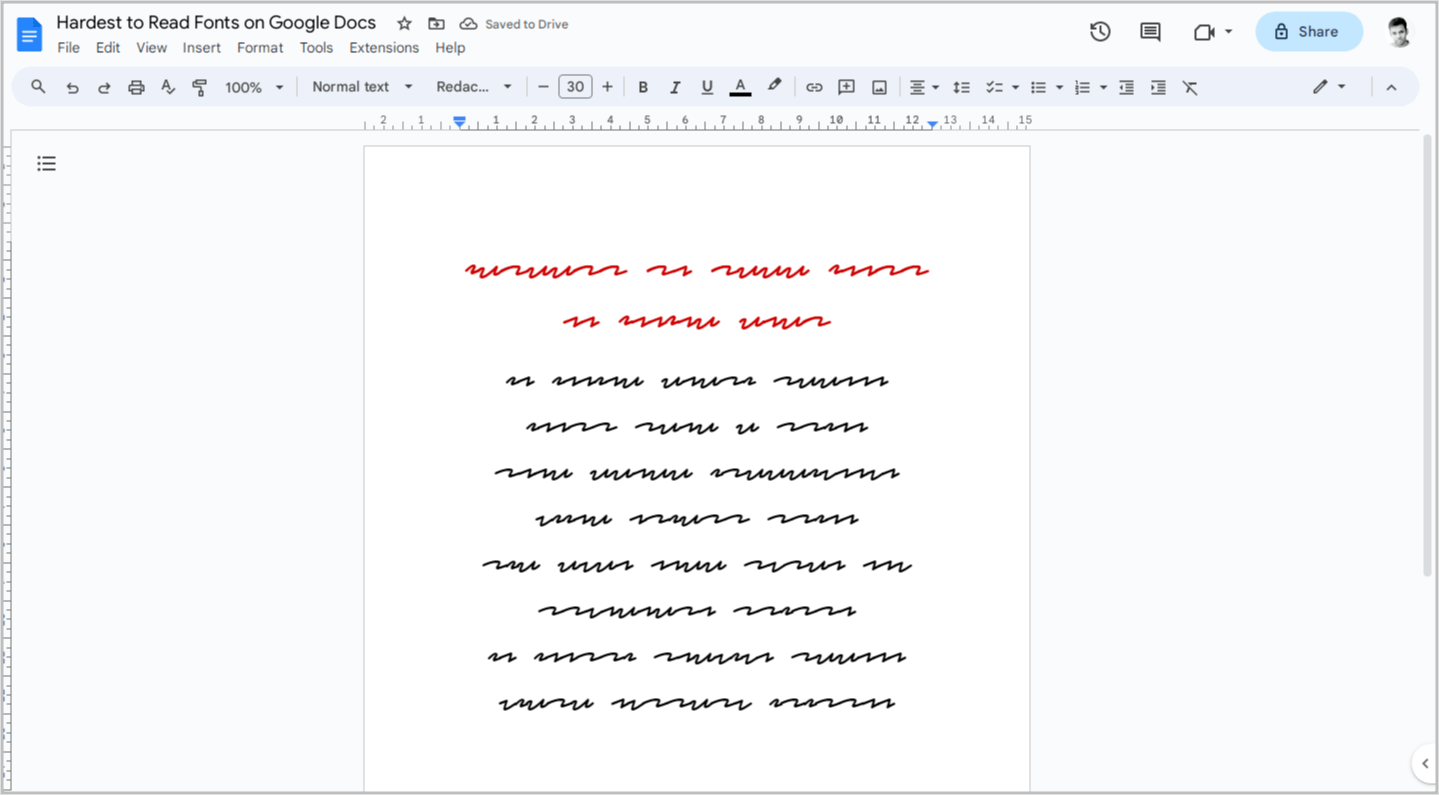
Redacted Script is the most difficult font to read on Google Docs.
It is designed with lines going up and down and scribbles, making it nearly impossible to decipher the letters.
This font can be used for fun purposes, but it is not recommended for formal documents.
2. Babylonica
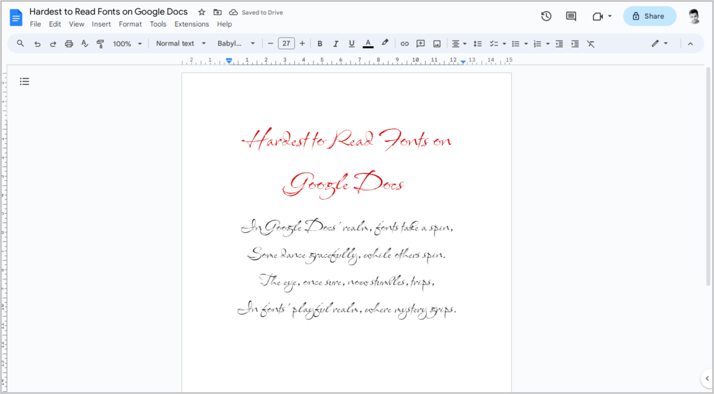
Babylonica is once again one of the most difficult fonts to read on Google Docs.
However, if you concentrate on each letter, you will be able to recognize the words.
It features unique strokes and a texture that gives it the appearance of being handwritten with an actual pen.
3. Ballet
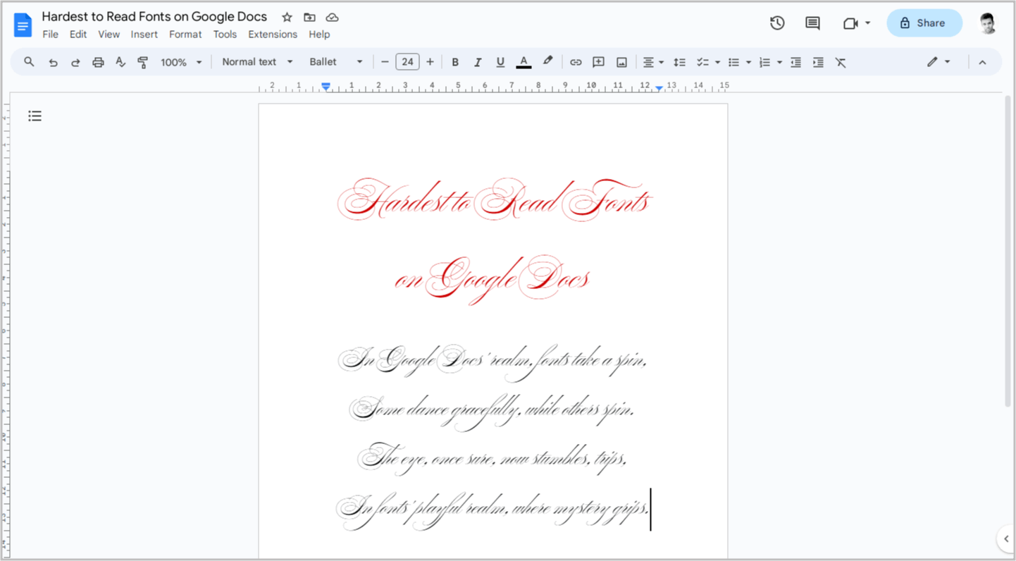
Ballet is a calligraphy font that contains many circles, making it difficult to read.
This font will give your documents a vintage appearance.
4. Cherish
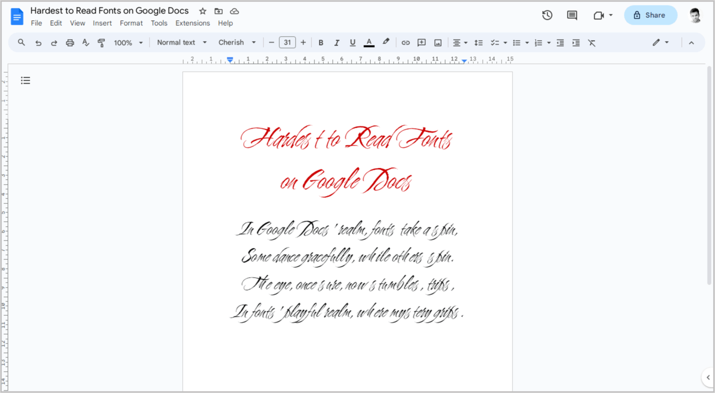
Cherish is a cursive font with a paintbrush-like texture. The letters are very close to each other, making it difficult to read.
5. Rubik Storm
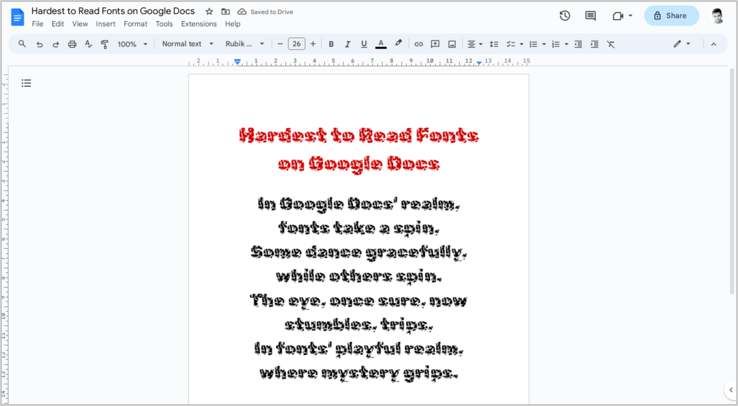
Rubik Storm is a bold font with a storm texture.
While it may be difficult to make out a single letter in a word, it becomes easier to read when you focus on the entire word.
This font is best suited for headings or titles due to its extra bold style.
6. Flow Block
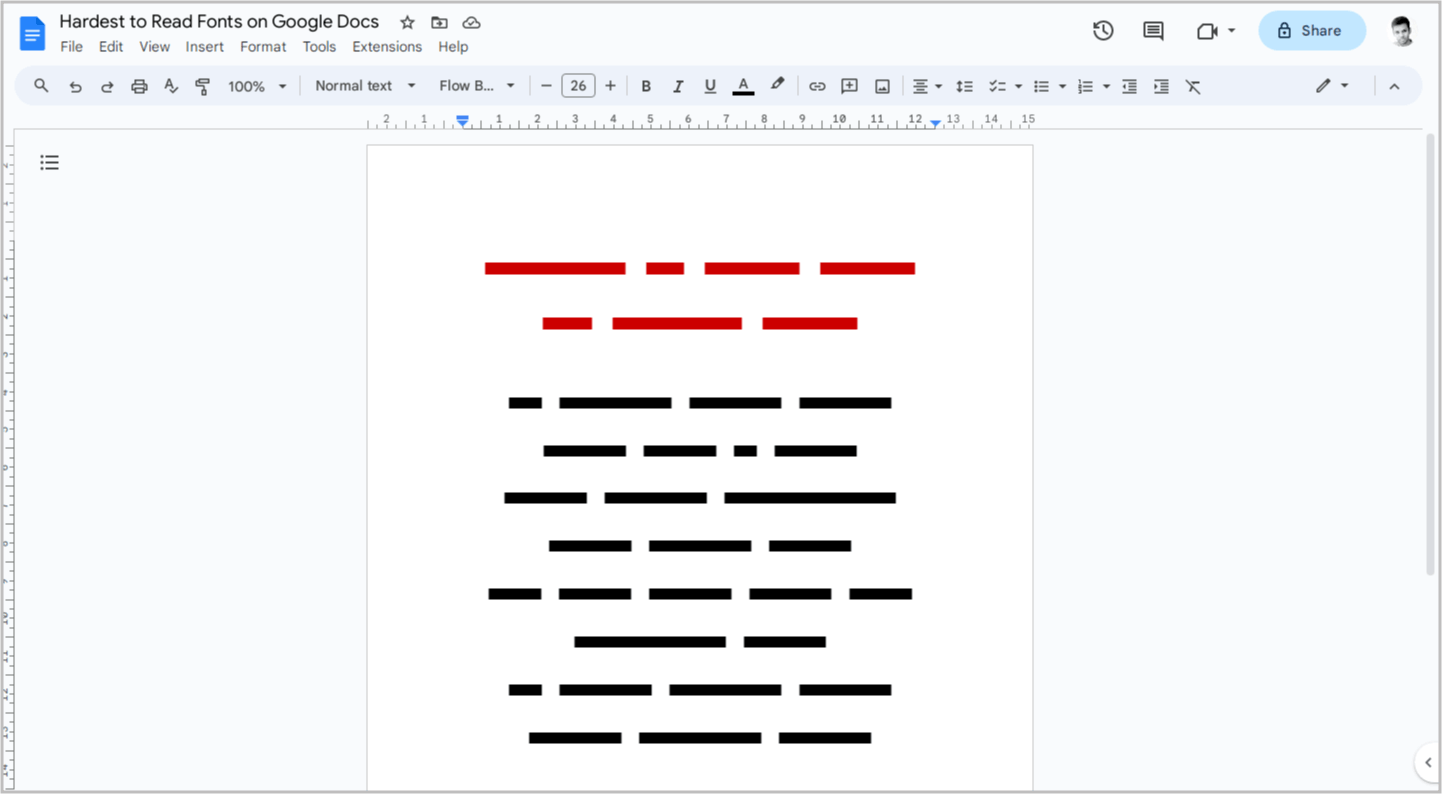
Flow Block is a joke.
No matter what letter you type, it simply displays a line.
Interestingly, you can even make this font bold and italic.
Give it a try if you want, but good luck trying to decipher it!
7. Herr Von Muellerhoff
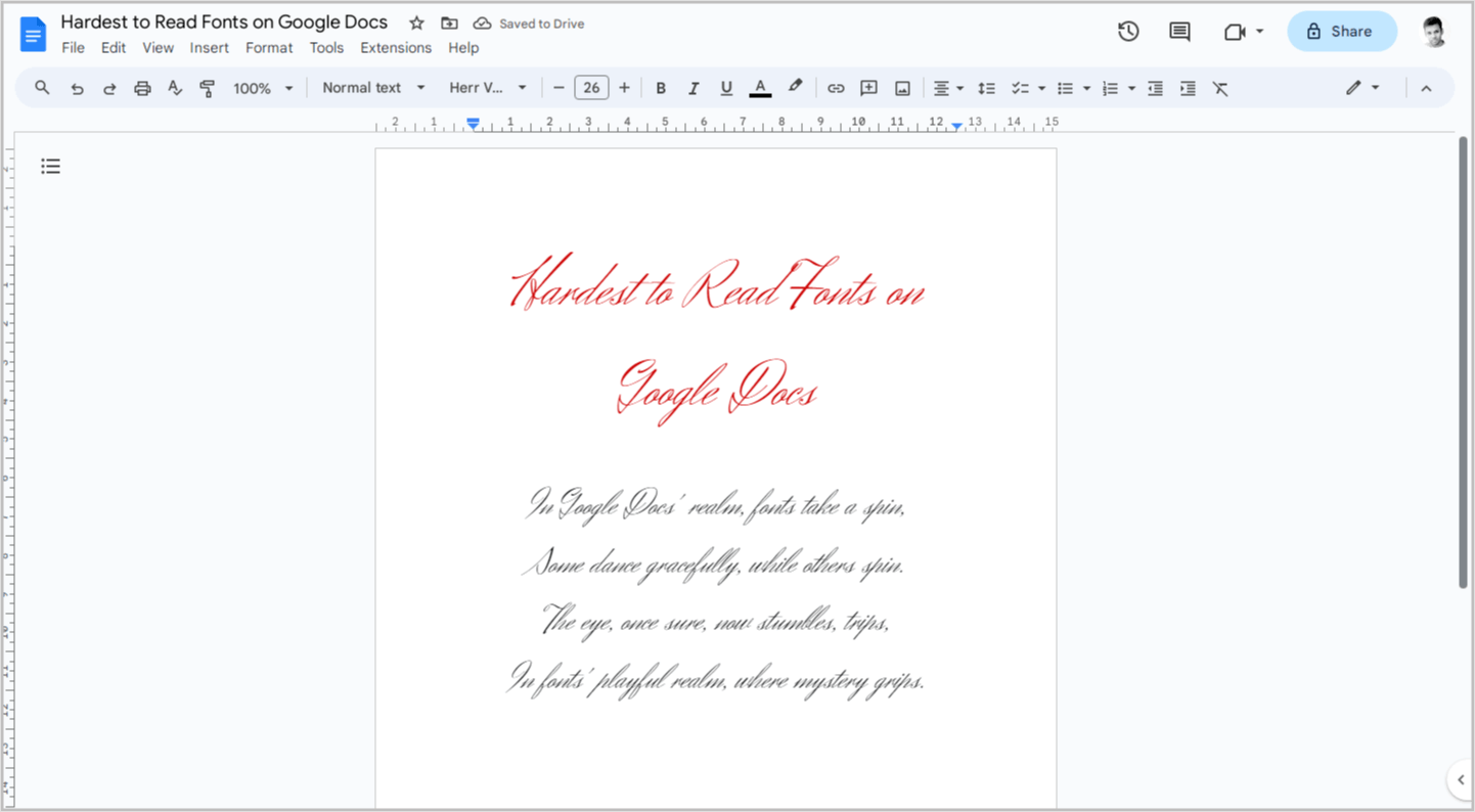
Herr Von Muellerhoff is a classic cursive font.
If you are accustomed to reading cursive text, you won’t have difficulty reading this font.
However, if you are not familiar with cursive fonts, you may find it challenging to read text using this font.
That wraps up our list of the 7 most eye-straining fonts lurking within the Google Docs library.
While we encountered other contenders, they weren’t quite as impenetrable. With a bit of squinting and focused deciphering, they could eventually be tamed.
However, these seven earned their spot thanks to their super-duper squiggles, indecipherable cursive, and overall illegibility.
