In this article, we will list 6 pixel fonts available on Google Docs.
Although the Google Docs font library boasts a vast number of fonts you can use for free, it offers very few pixel fonts.
So we have also added some dot fonts that give the pixel illusion.
In all, we found 6 fonts in the font library.
We have also embedded the screenshots of the fonts so that you can preview the image and then choose which one you want to use in your document.
Also read (opens in new tab):
Old English Font Google Docs
15 Best Aesthetic Fonts on Google Docs & Google Slides
25 Spooky Fonts on Google Docs
The Best Google Docs Typewriter Fonts
Elevate Your Google Docs with the Timeless Beauty of Celtic Fonts
Pixel Fonts on Google Docs
Don’t know how to add these fonts in Google Docs?
Read this guide: How to Add Fonts to Google Docs
1. VT323
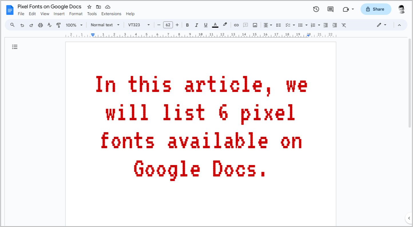
VT323 is hands-down the best pixel font available on Google Docs.
Its versatility shines, making it suitable for document titles, headings, and even body text.
We experimented with bolding the font, but it did slightly reduce the pixelated aesthetic.
The regular weight, however, is pixel perfection.
We also tried italicizing it, and it looked phenomenal, retaining the crisp pixelated charm.
If we had to choose the best pixel font from the Google Docs library, VT323 would be the clear winner.
2. Press Start 2P
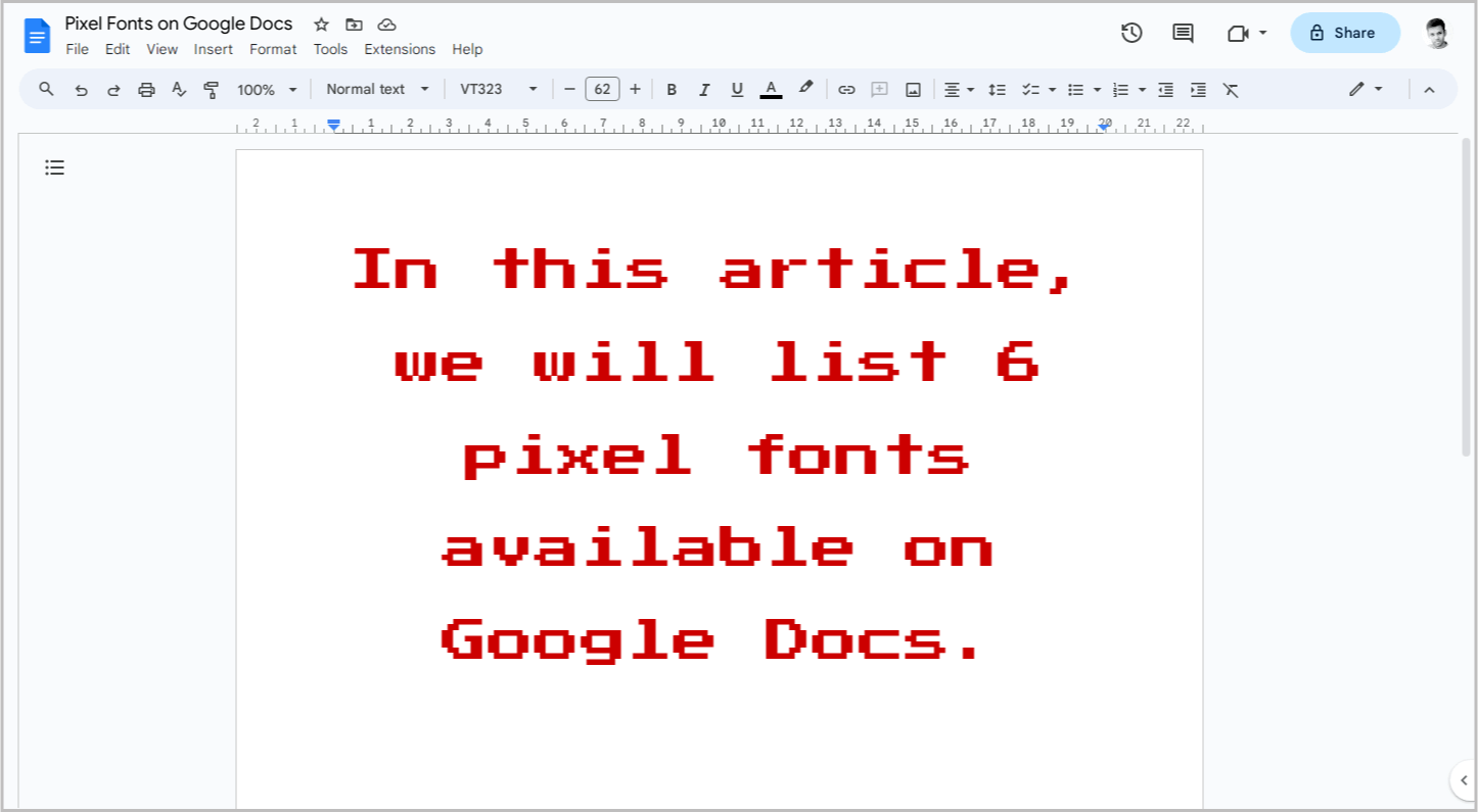
Press Start 2P is another fantastic pixel font you’ll find in Google Docs.
We experimented with bold, italic, and regular weights, and it truly shines in every style.
However, we wouldn’t recommend it for body text.
This font is a big personality, best reserved for headings and titles.
But if you crave the pixelated charm in your paragraphs too, fear not!
We recommend a dynamic duo: Press Start 2P and VT323.
Use Press Start 2P for those head-turning titles and headings, then let VT323’s crispness guide your body text.
This combo packs a punch without sacrificing readability.
3. Silkscreen
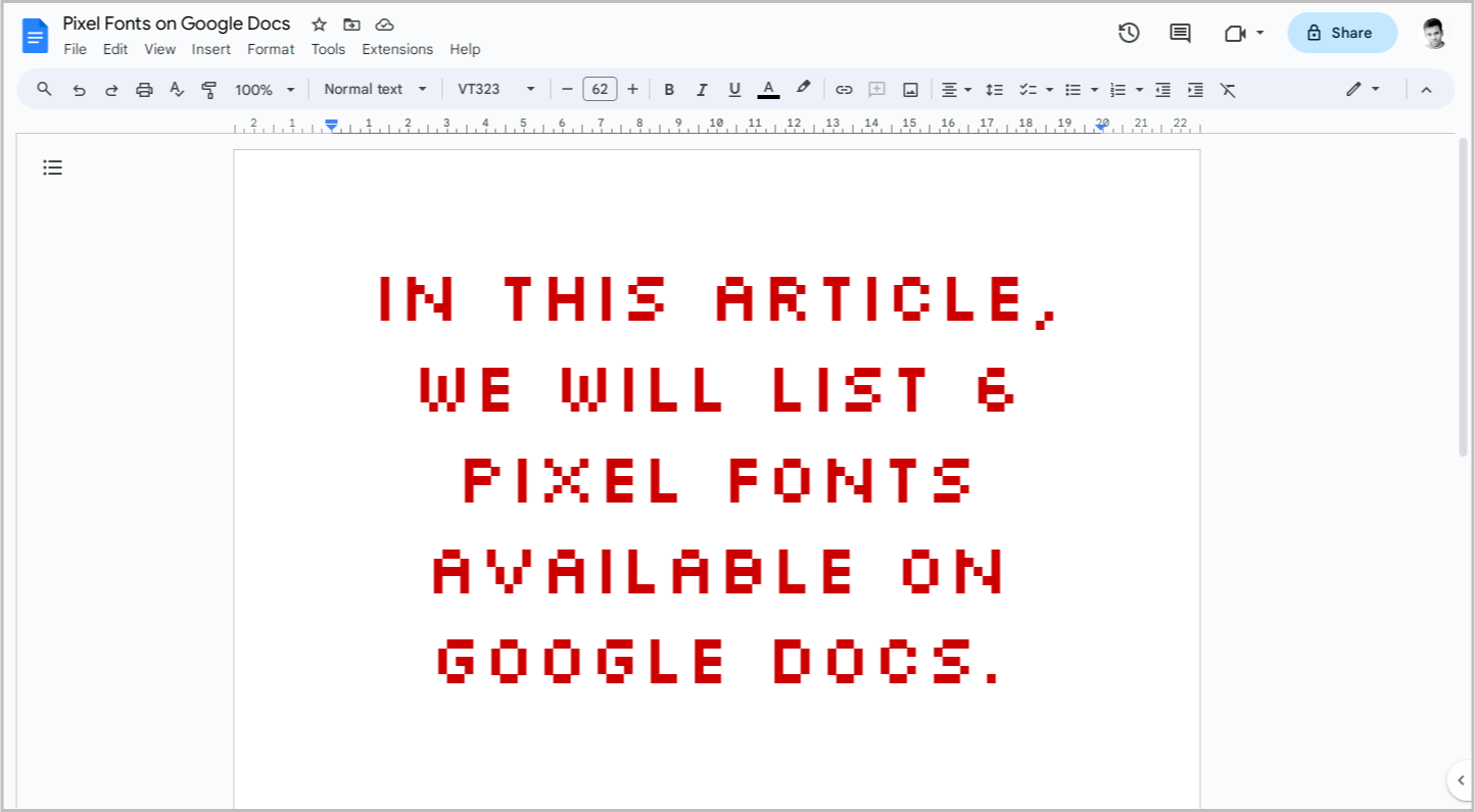
Silkscreen is another pixel font worth considering on Google Docs.
But be warned, it’s a bit of a rebel!
Not all the letters play by the pixelated rules.
Only those with curves or slants get the full blocky treatment.
This unique characteristic might be a hit or miss for your documents, depending on the desired aesthetic.
Additionally, bolding Silkscreen can affect readability, making it less suitable for body text.
Therefore, Silkscreen is best reserved for titles and headings where its playful personality can shine.
4. DotGothic16
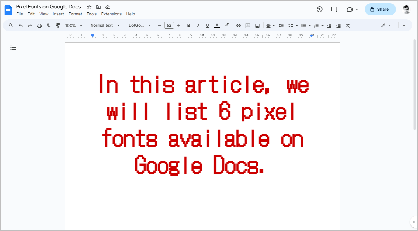
DotGothic16 joins the pixel party as another fantastic option.
We threw everything at it – bold, italic, underline – and it nailed every look!
However, a curious detail emerged when we left it at its regular weight.
However, one quirk to keep in mind: the line spacing.
In regular weight, it’s a bit generous, creating a slightly airier feel.
But bold it up, and suddenly the lines cozy up, looking perfectly normal.
This playful line-spacing shift hints that DotGothic16 might be best suited for titles and headings.
In the body text, the extra space can make it look unusual and, well, lengthy. You’ll be scrolling for days!
5. Codystar
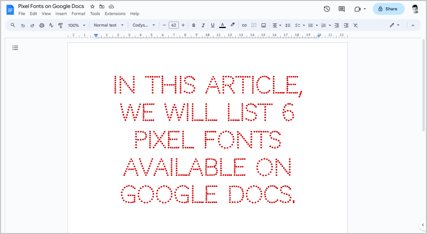
Codystar might not be your typical pixel font.
Instead of blocky squares, it’s crafted from delicate dots, creating a charmingly retro vibe.
However, its regular weight can be a tad too subtle.
Don’t worry, boldness is your friend here!
Codystar comes in three variations: Light, Normal, and Bold. We tested them all, and let’s just say Light… well, it lives up to its name.
It’s barely there, making it a no-go for most purposes.
The bold version, on the other hand, is perfect for headings, titles, and even paragraphs.
It packs a punch with its dotted personality without sacrificing readability.
Normal falls somewhere in between.
It can work in paragraphs, but only if you go big – think 20 points or more.
Otherwise, it risks getting lost in the text.
6. Raleway Dots
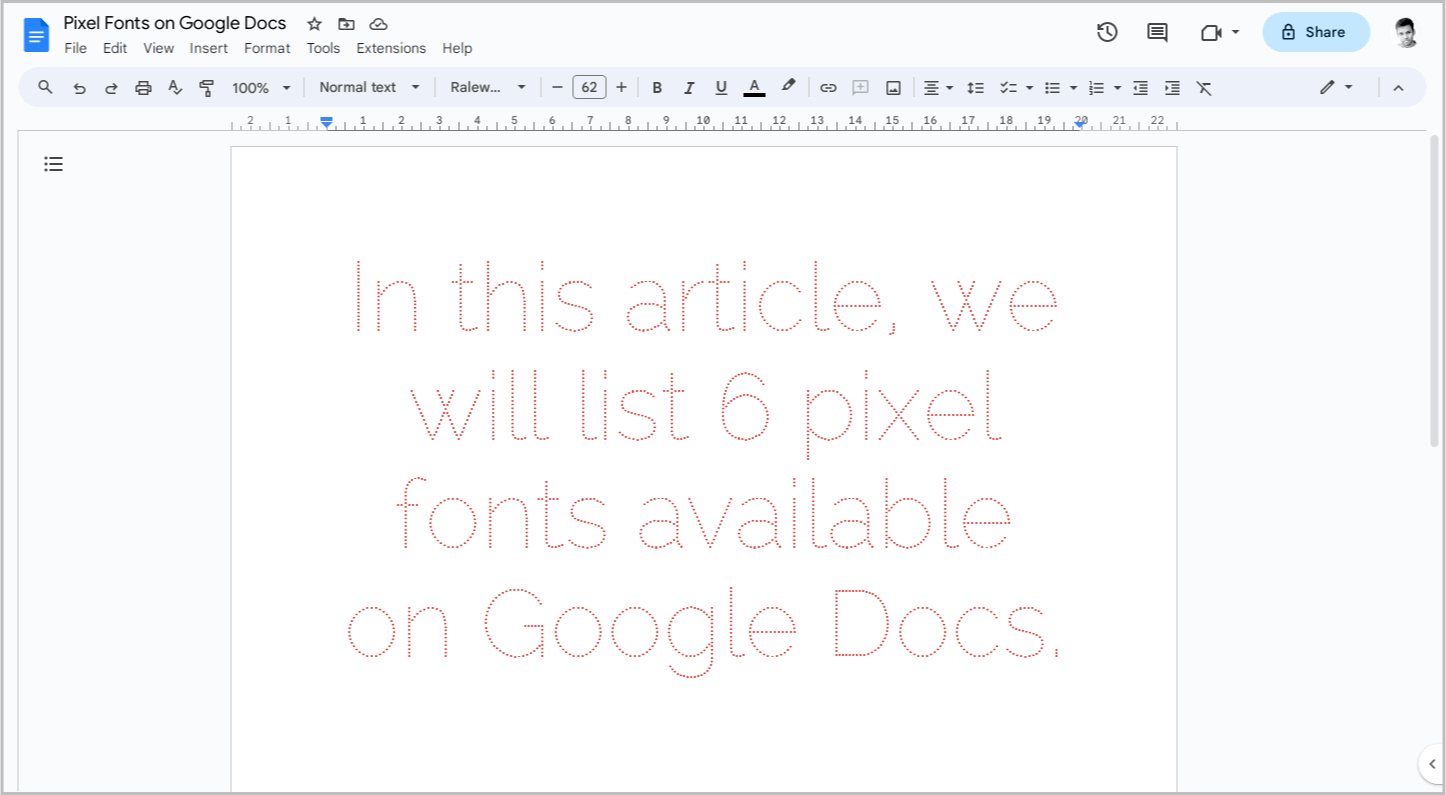
Raleway Dots might be the last on this list, but there’s a reason for it.
Just like Codystar, it’s not a true pixel font – instead, it’s a dotted version of the classic Raleway, trading blocky squares for delicate dots.
But here’s the catch: Raleway Dots isn’t your typical heading hero.
We tried keeping it regular, thinking it might work.
Then, we went bold – and surprise!
The dots vanished, leaving behind a plain old Raleway.
However, there’s a hidden gem within.
When you go bold and supersize it (think 100pt), the bold dots reappear, filling the gaps and creating a pixelated effect that gets lost at smaller sizes.
So, Raleway Dots is a bit of a chameleon.
It’s not for your headings unless you’re aiming for a giant, dotty statement.
But if you like its charm, consider it for your body text.
Conclusion
In conclusion, while the Google Docs font library may not offer an extensive selection of pixel fonts, there are still some great options available to add that retro charm to your documents.
Here’s a quick recap to get you started:
- Headlines & Titles: VT323, Press Start 2P, Silkscreen (for a playful touch)
- Body Text: VT323, Codystar (bold), Raleway Dots (bold & large)
- Big Statements: Press Start 2P, Raleway Dots (supersized)
