Want to learn how to create a pie chart in Google Docs?
Pie charts are a great way to visualize data in a way that is both easy to understand and visually appealing.
Even if you’re not a spreadsheet expert, they’re relatively easy to make.
In this tutorial, we’ll show you how to create a pie chart in Google Docs in just a few simple steps.
We’ll also give you some tips on customizing your chart so that it looks its best.
So let’s get started!
Also read: (opens in new tab)
T Chart in Google Docs (Tutorial + Free Template)
How to Delete Version History in Google Docs
How to Make Lined Paper in Google Docs
How to Merge or Combine Google Docs
How to Make a Pie Chart in Google Docs?
To make a pie chart in Google Docs, go to Insert > Chart > Pie. Choose “Open source” from the chart options. Replace the sample data with your own, customize the appearance through Chart style, and then update the chart by clicking “Update”. Adjust the chart position by selecting “Behind text” and dragging it.
Step 1: Go to Insert > Chart > Pie
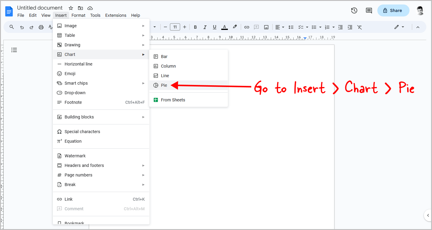
The first step is to open the Google Docs document.
Once the document is open, click on the “Insert” option from the top menu, and then select “Chart”.
From the list of chart types, select the “Pie” chart.
Now, you can proceed to the next step.
Step 2: Click on the chart to select it
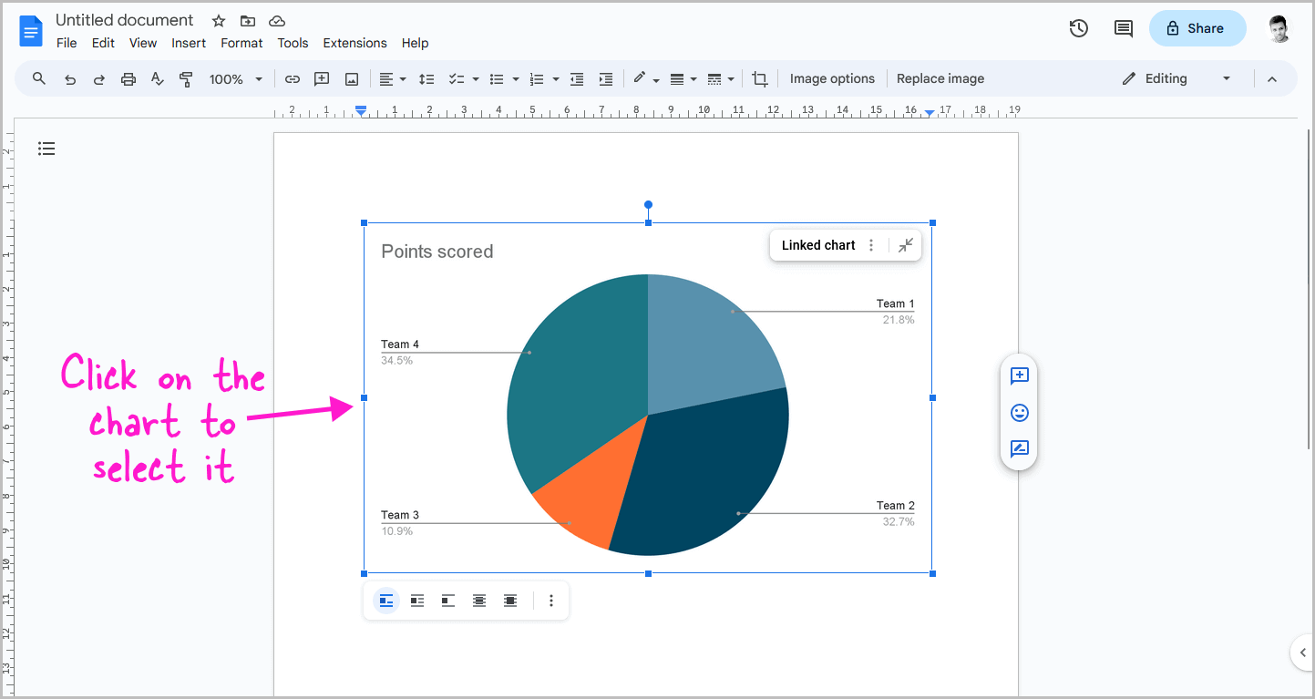
You will now see a pie chart with sample data in your document.
Click on the chart to select it.
Step 3: Click on the three dots and select “Open source”
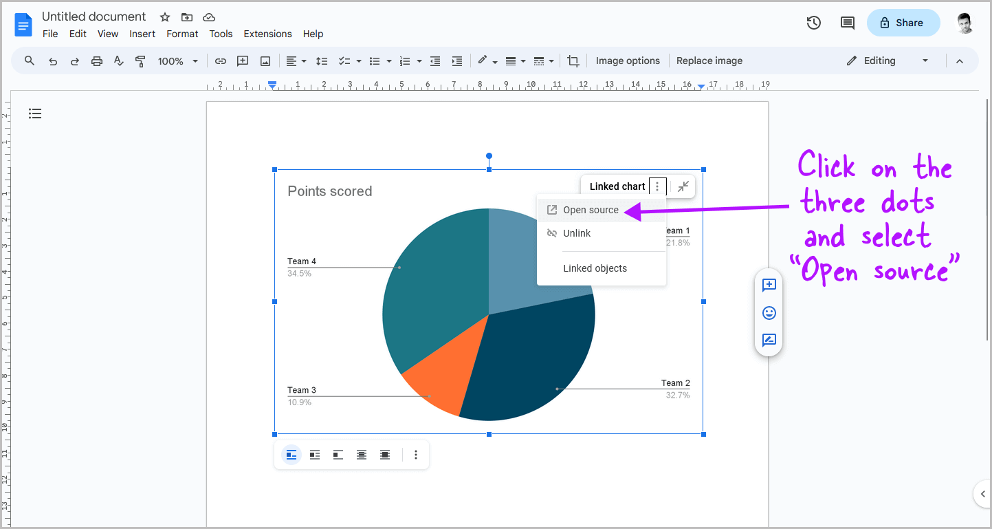
After clicking on the chart, you will see three vertical dots in the top right corner.
Click on them and select “Open source” from the drop-down menu.
Step 4: Replace the data with your own data
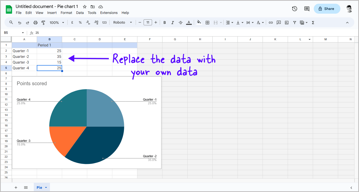
You will now see the chart in Google Sheets.
Scroll up to view the demo data.
First, replace the sample data with your own data, and then adjust the appearance in the following step.
To get started, click on each piece of sample data and replace it with your own data.
Once you have entered your data, move on to the next step.
Step 5: Customize the appearance of the chart
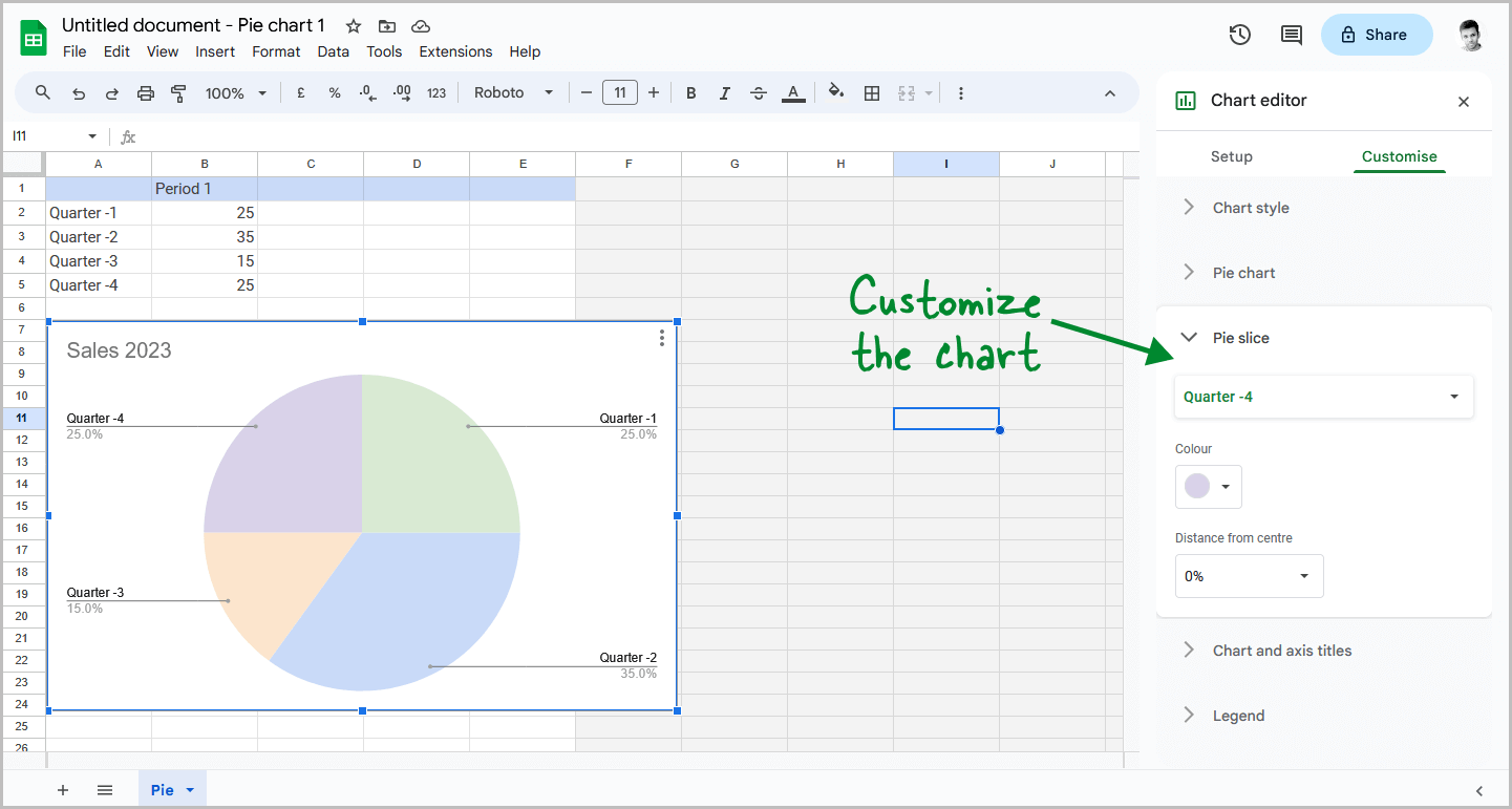
Now, you can customize the appearance of the chart.
First, double-click on the chart title and replace it with the title you need.
Next, right-click on the chart in Google Sheets and select “Chart style”.
Replace the chart color as you like and experiment with other customization options, such as making the chart 3D.
You can try each option until you get the desired pie chart.
Once you finish editing, move on to the next step.
Step 6: In Google Docs, click “Update”
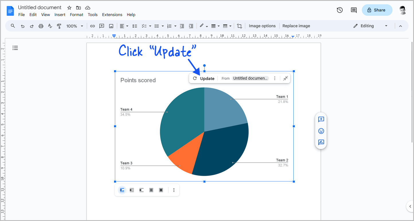
Now, go back to Google Docs.
Click on the chart to reveal the “Update” button at the top.
Click on it to update the pie chart.
You will now see the updated pie chart in your Google Docs document.
Step 7: Select “Behind text” from the image options
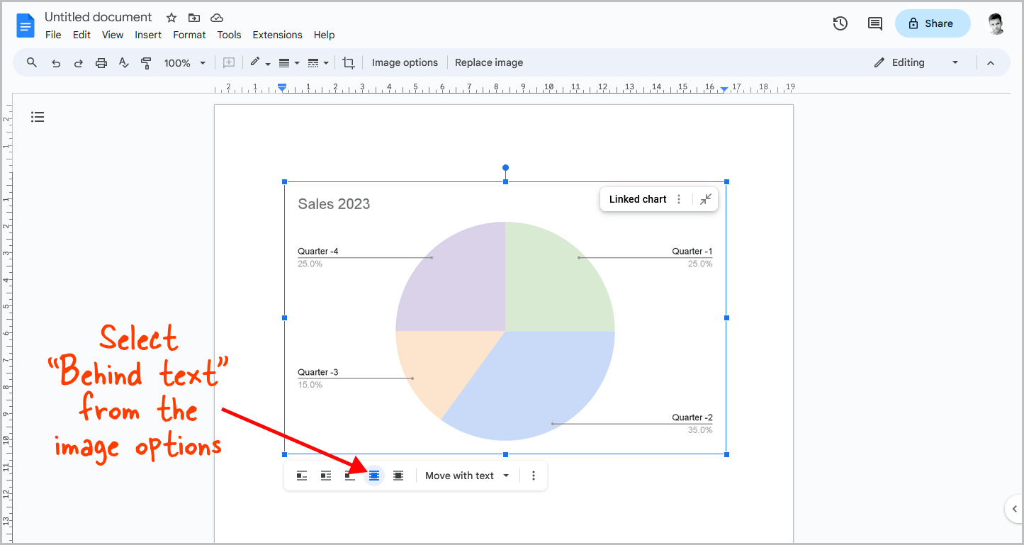
Now, click on the pie chart again.
You will see a small panel below the chart.
Click on “Behind text” from the panel and proceed to the next step.
Step 8: Adjust and move the pie chart as needed
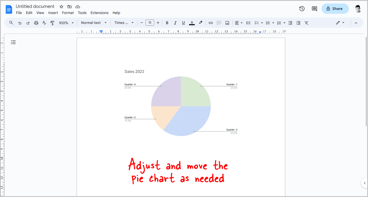
Finally, resize the chart if necessary, and drag it to the desired location in the document.
To edit the chart again, simply follow the above steps.
Summary
Creating a pie chart in Google Docs is a great way to visualize data in a visually appealing and easy-to-understand way.
It’s a relatively simple process that anyone can do, even if you’re not a spreadsheet expert.
Here’s how to make a pie chart in Google Docs:
- Go to Insert > Chart > Pie
- Click on the chart to select it
- Click on the three dots and select “Open source”
- Replace the data with your own data
- Customize the appearance of the chart
- In Google Docs, click “Update”
- Select “Behind text” from the image options
- Adjust and move the pie chart as needed
